Zara App Redesign
ROLE
UI/UX design + visual design
GOALS
Redesign the Zara app for mobile iOS to be more user-friendly and intuitive
SKILLS
Figma (design + wireframing), design thinking, user research, product design
While Zara is known for their sleek, high-end aesthetic, their website and app experiences are less than ideal. With a confusing interface that strives to be too different, the Zara app sacrifices usability and familiarity for aesthetics, resulting in a frustrating user experience. My redesign takes into account consumers’ pain points and prioritizes an intuitive user experience.
Why the Zara App?
Zara is known for their sleek, high-end aesthetic, which involves heavily edited, filtered, and styled editorial product photos. This editorial aesthetic is what elevates their brand and sets it apart from retail stores that sell clothing for similar age groups. However, this design choice frustrates their app users.
While Zara clothes are in high demand, their website and app experiences are less than ideal. With a confusing interface that strives to be too different, the Zara app sacrifices usability and familiarity for aesthetics, resulting in a frustrating user experience.
User Pain Points
Zara, without a doubt, has built a strong brand image and cult following. It has a 3.6 star rating in the iOS app store and is #55 in the Shopping category. To start my research, I looked at reviews left by users to understand the overarching problems in the current mobile experience. I used the different filters (most helpful, most favorable, most critical, and most recent) to gauge a holistic perspective.
Insights gathered from the iOS app store review section.
Click image to enlarge
What I Learned
Many users’ frustrations had to do with the fact that Zara sacrificed an intuitive user experience for brand aesthetics. There were many complaints about the app being impractical, having poor design choices in order to appear “high end,” and being difficult to navigate. Simply put, the Zara app is not intuitive.
Their trade of usability for aesthetics is also apparent in their choices outside of the app. Many users expressed frustration in the way their clothes were styled on the models, in how the models were posing, and in their overly filtered/blurry photos.
Users want Zara to put the consumer first, ensuring that their shopping experience is seamless, thoughtful, and intuitive.
Opportunity
With Zara having built such a strong, high-end brand image that elevates and separates them from similar retailers, it would be a shame for their poor app usability to lower their customer satisfaction and overall user experience.
The opportunity here is to redesign the Zara app to have better navigation to assist the customer in finding what they are looking for without sacrificing Zara’s well-known brand aesthetic.
The opportunity also lies deeper than a redesign of an app. The goal is to create an immersive and easy shopping experience for the user from the comfort of their home. Shopping as a form of retail therapy or leisure should be easy and the customer’s experience should always be prioritized.
Competitive Analysis
I thought it would be interesting to put the Zara app up against the Zara Home app (lifestyle & home goods), which is much more intuitive and is still able to carry the elevated aesthetic of the overall Zara brand. This app is able to do what the Zara app isn’t, which is to provide a pleasing user experience without sacrificing the Zara brand look.
For the other comparisons, I chose Forever 21, H&M, and Urban Outfitters, all of which have a similar target audience as the Zara app.
For the competitive analysis, there were three things that the above apps were doing well that the Zara app was missing:
Alternative product views to cater to the user’s preferences
User-focused, easy-to-navigate filtering categories for the clothes
Intuitive and familiar navigation that eliminates confusion and reduces learning for the user
New User Flow
Click image to enlarge
Wireframes
Bookmarks Page
Profile / Settings Page
Search Page
Home / Landing Page
Shop Page for a Category
Shopping Menu
Shopping Cart
Product Page
👉🏻 Interact with the final prototype here
Key Changes Explained
Key Change #1
Added a “Model” vs “Product” view to cater to the user’s browsing preference
This allows Zara to keep their editorial photos while also giving the user the option to view product-only photos
Added a single column vs a two-column view to cater to users’ browsing preferences
Removed Zara’s top sliding bar because it is unintuitive and only the middle view provides all the necessary information that the user actually needs
Current design
Proposed change
Key Change #2
Refined and restructured Zara’s categories to be more intuitive
In their current layout - it does not make sense to list their “Careers” page under “Woman” in the Shopping category
In their current layout - “Shoes & Bags” and “Sale” appear in multiple sections in the same list
Added a “Trending Now” section to give users an overview of trending Zara items
Current design
Proposed change
Key Change #3
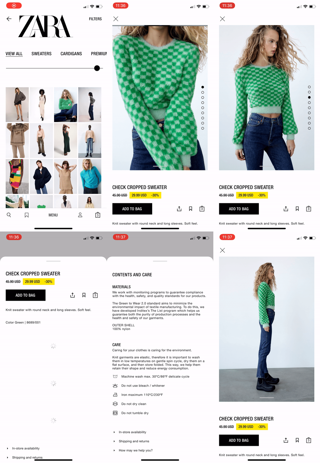
Simplified the product page viewing experience by having product details and more appear as overlays when clicked
Added “Reviews” and “Others Also Bought” sections to build an in-app community experience where users can read others’ feedback and see others’ purchasing choices
Changed Zara’s product photos scrolling style from vertical to horizontal, which is more intuitive. Vertical scrolling is reserved for browsing the entire product page
In the current design, the Zara app is using vertical scroll for both scrolling through product photos and the product page itself, which can cause confusing overlap
Current design
Proposed change
Reflections and Feedback
By designing for a real-world product, I used my research to understand consumers’ pain points and my design-thinking skills to create solutions for each of their problems. By doing competitive analysis research, I now have a better knowledge of current industry design best practices.


